Nvu
User Guide
Positioning

Subject index
Appendix 6 - Understanding Positioning
Appendix 6 - Understanding Positioning
A6.8 Collapsing margins
In this section
A6.8.1 Which margins collapse ?
| Collapsing behaviour of margins for certain items | |||
|---|---|---|---|
| Horizontal margins | Never collapse | ||
| Vertical margins | In normal flow | Absolute positioned item | Floated items |
| Text blocks | Collapse | Never collapse | |
| Divs | Collapse | Never collapse | |
| Lists | Collapse | Never collapse | |
| Tables | see text | Never collapse | |
| Images | Never collapse | ||
When discussing the box model we saw that items in normal flow are separated vertically by the greater of the bottom margin on the first item and the top margin on the next item.
Although the situation rarely arises, horizontal margins never collapse. For items appearing side by side horizontal margins do not collapse and the spacing is given by the sum of the margins.
The rules for when margins do and do not collapse are to be found in section 8.3.1 of the CSS2.1 Specification though some is not easy to interpret. The following are the main cases of interest.
Vertical margins collapse for 'block boxes' in the 'normal flow'. Text blocks, divs, lists and tables are 'block boxes' but images are not, therefore margins of images do not collapse.
Note. Vertical margins on tables collapse with most browsers but Firefox, up to version 1.5 fails to do so.
Absolutely positioned items and floated items are not in 'normal flow' so margins on these items do not collapse.
Table A6.8-1 summarises important cases.
A6.8.2 Top to top
Collapse of margins is often thought of only in terms of a top margin of one item collapsing against the bottom margin of the previous item. This is not the only case.
The top margin of an item may collapse against the top margin of the first item it encloses.
Let's have a look at it. (If there was a gap above this paragraph that is because it is set to clear the table.
Here is a div with paragraph of text in it. It has a background colour so that you can see where it is.
It appears close to the paragraph above as you would expect.
The essential style information is:
<div style="background-color: rgb(255, 255,
204); margin-left: 3em;">


<p> … </p>


</div>
The paragraphs have a left margin because they use the same style as other paragraphs.
Let's do that again.
This time, just because it is a new division it has been given it a top margin of 3em to separate it from the paragraph above.
And indeed the margin results in a gap above the div.
The essential style information is:
<div style="background-color: rgb(255, 255,
204); margin-left: 3em; margin-top: 3em;">
<p> … </p>
</div>
So let's do it again.
Heading for new topic
But a new topic deserves a new heading. Headings should be separated from material above so the heading was given a top margin of 2em.
The essential style information is:
<div style="background-color: rgb(255, 255,
204); margin-left: 3em; margin-top: 3em;">


<p style="margin-top: 2em; font-size: large;"> Heading …
</p>


<p> … </p>


</div>
Woops! Where did the margin above the paragraph acting as a heading go? There should be a margin between the heading and the top of the division. What actually happened is that, because the division had a top margin of 3em and the heading a top margin of 2em, the heading margin was swallowed up by the division margin and apparently disappeared.
Fortunately there is a solution.
Here it is
Eric Meyer has explained how to solve the problem. Add a border. Without the border the top margin on the heading merged with the top margin on the div but adding a border stopped that. If you don't want to see the border just make it the same colour as the background, or even more elegantly make it transparent!.
The essential style information is:
<div style="border: 1px solid rgb(215, 215,
172);
background-color: rgb(255, 255, 204); margin-left: 3em; margin-top:
3em;">
<p style="margin-top: 2em; font-size:
large;"> Heading … </p>


<p> … </p>


</div>
Note MSIE6 does not respond to transparency for borders so the colour of any border added should match that of the background.
It may be more convenient to add some padding. This is just as effective as a border and will always be invisible. Whether border or padding is added it is the top section which is required. Others are optional.
A6.8.3 Acquired margin
We have already
noted that a division styled with position:
relative; can be very useful simply as a holder within
which to position other items using position:
absolute; nevertheless this practice brings some
unexpected traps for the unwary.
This will be illustrated using a number of examples. Each is located in a division which has a yellow background and is immediately preceded by a horizontal rule.
Here is a division holding a
paragraph of text. The division
is styled as position: relative; to
allow it to be used to position other items within it. The yellow
background identifies exactly where the containing block formed by the
division is.
The essential style information, including the preceding rule, is:
<hr style="margin-bottom: 0px;">

<div
style="background-color: rgb(255, 255, 204); position:
relative;">


<p style="margin-top: 0px;"> … </p>
There is nothing positioned within it.
The next division (below the horizontal rule) uses styles identical to this one. It holds two paragraphs which have been given width 33%. The margins on the paragraphs, which are used elsewhere on this page, have been removed so that the position is clearer.
- The first paragraph has an absolute position with
left:
50%
- The second paragraph is not positioned and appears directly in the flow.
The essential style information, for the division and two
paragraphs,
is:
<hr style="margin-bottom: 0px;">

<div style="background-color: rgb(255,
255, 204); position:
relative;">

<p style="position: absolute; top: 0px;
left: 50%; width: 33%;
margin-left: 0px; margin-top: 0px;">
This is the first
paragraph. … </p>
<p style="width: 33%; margin-left: 0px;
margin-top: 0px;">
This is the second paragraph. … </p>
</div>
This
is the first paragraph. It is the first item in the code for the
division and is positioned with position:
absolute; top: 0px; left 50%. The position is referenced
to the top
left corner of the division, since the division has no margin nor
padding.
This
is the
second paragraph. It is
not positioned so appears 'in the flow'. Because the other paragraph
has position:
absolute; it is taken out of the flow so this one,
being in the flow, looks as
if it occurs first. This one also controls the height of the division
because it is in the flow.
Hopefully that gave no surprises and appeared as you expected.
The next division, following the horizontal rule, is an exact repeat of the previous except that there is a heading in the flow before the paragraph and some text has been altered.
The essential style information is:
<hr style="margin-bottom: 0px;">

<div style="background-color: rgb(255, 255,
204); position: relative;">


<p style="position: absolute; top: 0px; left: 50%; width: 33%;
margin-left: 0px; margin-top: 0px;">
… This is the first
paragraph. … </p>
<h1 style="text-align: left;">Here is a
heading</h1>
<p style="width: 33%; margin-left: 0px;
margin-top: 0px;">
This is the second paragraph. … </p>
</div>
This
is the first paragraph. It is the first item in the code for
the division and is positioned with position:
absolute; top: 0px; left 50%. The position is referenced
to the top
left corner of the division.
Here is a heading
This is the second paragraph. It is preceded by the heading. Neither are positioned. The other paragraph is positioned and is the first item in the code in the division.
At a glance you might think this is exactly what to expect. Look again. Where is the division? In the code for the page the division comes immediately after the horizontal rule. Yet there is a gap which did not occur with the previous example. Why?
Actually there is no gap! It only looks as if there is one!
First. Note that the position of the heading and positioned paragraph appear on the background of the division (i.e. in the containing block) where you would expect them. It is the containing block which is not where you expect.
Remember that positioning does not take place directly within a block it takes place in the containing block formed in the block. This is bounded in this case, for a block without a border, by the padding edge, that is the inner edge of the margin. The background also fills this area so the heading and paragraphs are found in the correct positions relative to this containing block (box).
So the positioning is taking place correctly within the box. Why is the box displaced? It is another case of margin collapse. The heading here, though it has no specific margin mentioned, takes the standard top heading from h1 as defined in the stylesheet for the page. The top margin on the heading and the zero margin on the division have merged. The top of the margin is in the expected position, immediately below the rule, but the margin on the heading has pushed the containing block downwards.
Effects like this will in most cases probably pass unnoticed but occasionally may cause chaos.
The solution, to remove the gap, is exactly as before. Put a border or padding on the division. we will put a 1px padding on the top of the div to demonstrate. Using Firefox this could be reduced to 0.1px but MSIE requires at least 1px.
The only difference from the styles listed above is for the division:
<hr style="margin-bottom: 0px;">
<div style="background-color: rgb(255, 255, 204); position: relative; padding-top: 1px;">
…
</div>
This
is the first paragraph. It is the first item in the code for
the division and is positioned with position:
absolute; top: 0px; left 50%. The position is referenced
to the top
left corner of the division.
Here is a heading
This is the second paragraph. It is preceded by the heading. Neither are positioned. The other paragraph is positioned and is the first item in the code in the division.
The heading now appears separated from the top of the division by the normal heading margin. In fact this case has become identical to that considered earlier.
A6.9 Lists
- List A6.9-2
- 'Outside'
- Item 3
- item 4
- Item 5
- Item 6
- Item 7
- Item 8
- Item 9
- Item 10
- Item 11
- Item 12
- List A6.9-1
- 'Inside'
- Item 3
- Item 4
- Item 5
- Item 6
- Item 7
- Item 8
- Item 9
- Item 10
- Item 11
- Item 12
A6.9.1 Types of list
Lists are a special case which introduce some unique considerations when precise positioning is required.
Basically CSS provides for two types of list, ordered lists (ol) and unordered lists (ul). Each of these types contains list items (li). The difference is that ordered lists prefix each list item by a number or letter to indicate the sequence whereas unordered lists use the same symbol, e.g. a bullet, for each item.
Each type of list may be displayed in one of two modes. Modes are controlled by the 'list-style-position' property, this can take the value 'inside' or 'outside'. The difference between these two modes will become clearer later but for now observe the two examples on the right.
Tip CaScadeS does not support List-item-position specifically. Either from the Status bar use the Advanced property editor or edit the CSS file manually.
The difference usually becomes clear only with long ordered lists. With list-style-position set to 'inside' the numbers are left aligned but the text may become ragged. By setting list-style-position to 'outside' the text items are left-aligned with the numbers right-aligned.
Note If you view this page using MSIE you will note that it attempts to maintain the text aligned neatly. With long lists formatted with list-style-position: inside it may run out of space for the numbers so numbers and text may overlap.
MSIE differs from other browsers in the defaults it applies to lists. All browsers will display simple lists satisfactorily at their default settings however once you start applying style settings to the elements in a list you may find differing and perhaps unsatisfactory results. The solution is to apply a comprehensive and appropriate set of parameters to restore order.
Since ordered lists are a little more complex than unordered lists only these will be discussed further. Unordered lists behave like ordered lists in which the number never exceeds one character in length.
A6.9.2 List box structure
Lists are laid out according to the normal box positioning rules. There are three boxes involved:
-
The containing block in which the OL element resides
Fig A6.9-1 List item (li) structure

- The OL block – 'Positioned' within the containing block and forming a box in which the list items reside
- The LI blocks – 'Positioned' in normal flow within the OL box
Fig A6.9-2 Box formed when list-style-position is inside

Fig A6.9-3 Box formed when list-style-position is outside

The LI blocks are however a little more complex than usual. They involve both text and the prefix as illustrated in fig A6.9-1. The box formed depends on the value of the list-style-position property.
Fig A6.9-2 shows, outlined in magenta, the box formed when the list-style-position is 'inside'. As expected, the prefix is enclosed by the box.
Fig A6.9-4 Effect of padding on LI

Fig A6.9-5 Effect of margin on LI

In contrast, when the list-style-position is 'outside' as fig A6.9-3 shows, the box encloses only the text part and the prefix lies outside the box.
It is now possible to predict the effect of margin and padding on the list item. The case when list-style-position is 'inside' becomes trivial. Margin-left will move the whole box to the right while padding-left will move all the content to the right. The visual appearance will be identical. Margin and padding top, bottom, and right will all behave in the normal way.
When list-style-position is 'outside' more consideration is required. Fig A6.9-4 shows the effect of padding-left. The text content of the box will be moved across but the prefix, being external to the box is unaffected. Fig A6.9-5 shows the effect if margin-left ???. The box along with the prefix are moved right.
Fig A6.9-6 Block layout with list-style-position:inside
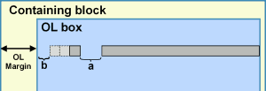
Fig A6.9-7 Block layout with list-style-position:outside
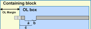
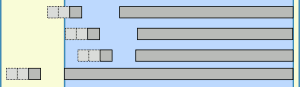
Fig A6.9-8 Block layout with list-style-position:outside for various values of padding on li
It may be noted that the gap between prefix and text are fixed by the browser and not directly controllable using styles other than by using padding on the li element.
A6.9.3 Styling lists
Figures A6.9-6 and 6.9-7 summarise the block arrangements and style properties for lists in each of the two display modes. (It is assumed that the list is in the flow of the page, equally well it could have position: absolute or relative.) In these:
For list-style-position: inside
- 'a' represents the preset space allocated by the browser
- 'b' represents li padding-left + ol padding-left + li margin-left
For list-style-position: outside
- 'a' represents the preset space allocated by the browser
- 'b' represents li padding-left
- 'c' represents ol padding-left + li margin-left
By manipulating these properties it is possible to move the position of a complete list or one item and for lists with list-style-position: outside it is possible to alter the space between the prefix and the text.
This freedom is illustrated in fig A6.9-8 showing that the prefix can be positioned from fully within the ol block box to fully outside this.
A6.9.4 Overflow
When the prefix in whole or in part lies outside the box overflow has occurred. Mozilla browsers treat this normally. Overflow defaults to visible and the prefix appears. If overflow is set to 'hidden' the prefix or part of it disappears. MSIE (up to version 7) treats this differently and overflow is always hidden. This being so it is important to avoid the prefix overflowing the OL box by adding sufficient padding-left to the li element to allow for the prefix. If the padding is expressed in em units it will automatically accommodate text zooming. If expressed in pixels and the list is long there is the possibility that at large zoom factors the some characters of the prefix could move out of the box.
A6.9.5 Example and summary
By taking control of the style properties on list elements it is possible, with one small exception, to position and space lists as desired. the exception is that when the list is displayed with list-style-position: inside no control of the space between the prefix and the text is possible.


Nvu User Guide - Based on Nvu version 1.0 - Updated dd-mmmm-yyyy